EXCLUSIVE: A FIRST LOOK INSIDE DAVID ADJAYE’S NEW MANHATTAN SKYSCRAPER
David Adjaye has shared with ELLE Decor an exclusive look inside 130 William, a striking 66-floor residential tower in Manhattan’s Financial District and the renowned architect’s first high-rise in the United States.
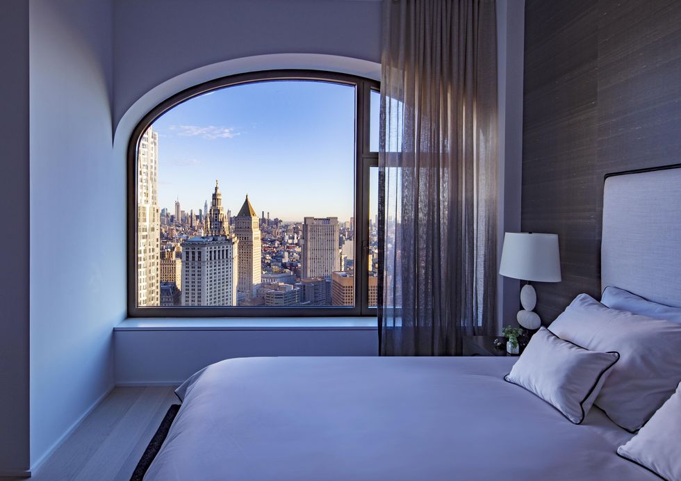
Though the 800-foot tower, developed by Lightstone, is set to officially be completed in the fall, residents have been moving into the striking structure since December. Adjaye designed its decidedly contemporary facade in inky, hand casted concrete (a material he explored uptown in one of his earlier New York projects, the Sugar Hill development) punctured by rhythmic, arched windows. In this way, the architect says, the form celebrates Gotham’s architectural history while providing a visual foil to the neighborhood’s sea of nondescript office and residential buildings.
“I actively sought to move away from the commercial feel of glass and instead celebrate New York City’s heritage of masonry architecture whilst recognizing the current grid of the city,” Adjaye told ELLE Decor in an emailed statement.
To achieve that, the architect and his team were inspired by the craftsmanship behind the area’s historic towers (the iconic Woolworth Building is just a short walk away), and the character of the merchant buildings that once defined the neighborhood. A public garden at the building’s base provides much needed community space. “All,” Adjaye notes, “collectively contribute to a unique new addition to both the Manhattan skyline above and the street identity below.”
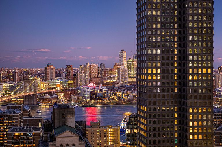
Adjaye’s team embraced the challenge of leaving its mark on the skyline, but also wanted the communal spaces and 242 residences—all part of what he calls a “vertical micro-city within a city”—to feel like a refuge, especially amid the hustle and bustle of lower Manhattan.
“In a tall building like this, where you have so many apartments, it is not that common to still feel like you’re coming home to your own place,” explains Marc McQuade, an associate principal at Adjaye Associates who oversaw the project. “So a lot of the moves are intended to make it feel like it still has the warmth of being at home.”
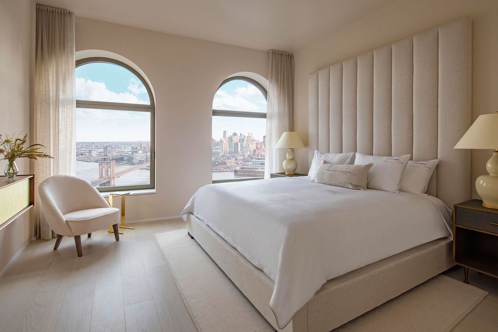
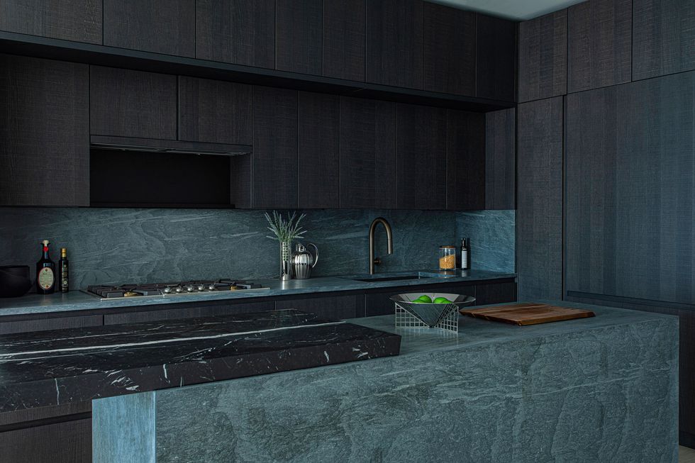
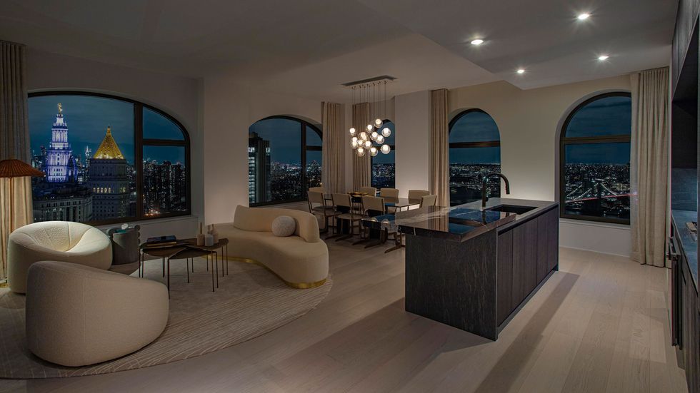
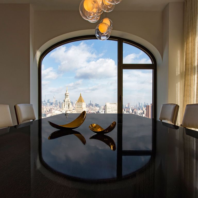
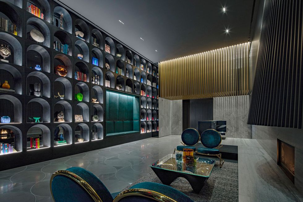
“We went with a very clean and minimal palette that didn’t distract from the views,” adds Adrienne Colenburg, who heads up the firm’s New York interiors practice. “So you’ll see a lot of curved forms in the furniture, but we also picked up on some of the brass details that you see in other parts of the building.”
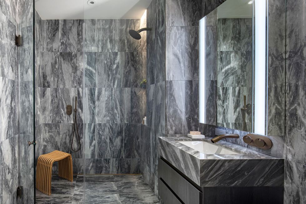
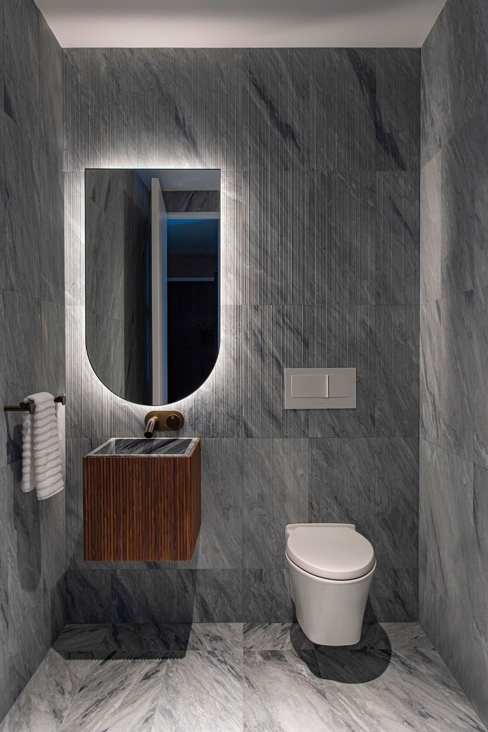
Bespoke hardware and fittings (designed in-house) reference the building’s brass mullions and roof bulkhead. Fluted Cararra marble cladding in the bathrooms (hand selected on multiple trips to Italian quarries) tip a hat to the grooved exterior cladding. One two-bedroom model residence overlooking the Brooklyn Bridge features furnishings by Pierre Paulin, Kelly Wearstler, and Minotti, as well as items from New York makers and galleries including Bower Studios and the Future Perfect.
“I wanted the residents to feel a deep connection to the city, to its history and its language,” Adjaye reflects. “I hope people living there feel that type of energy as they grow with the space, both as residences and as a community in the city of New York.”
